Blis Logo and PackagingDesign
Client: Blis, Dubai
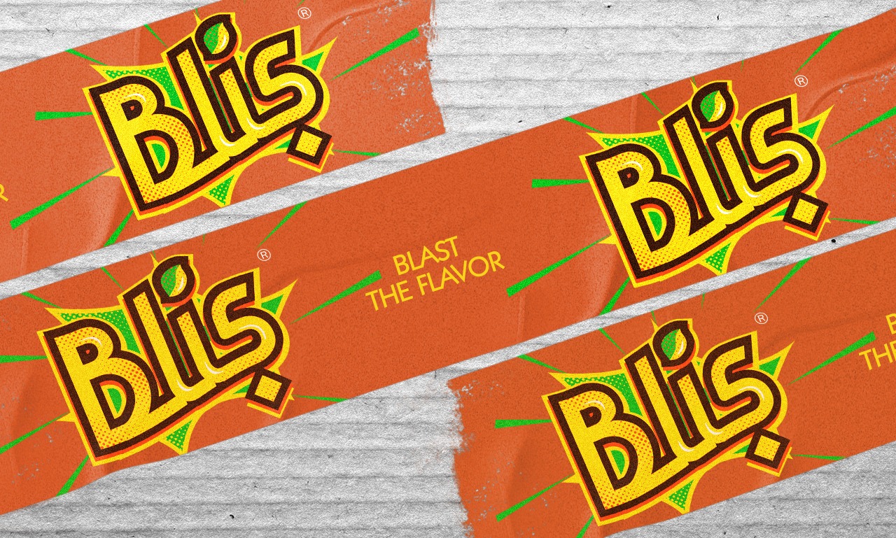
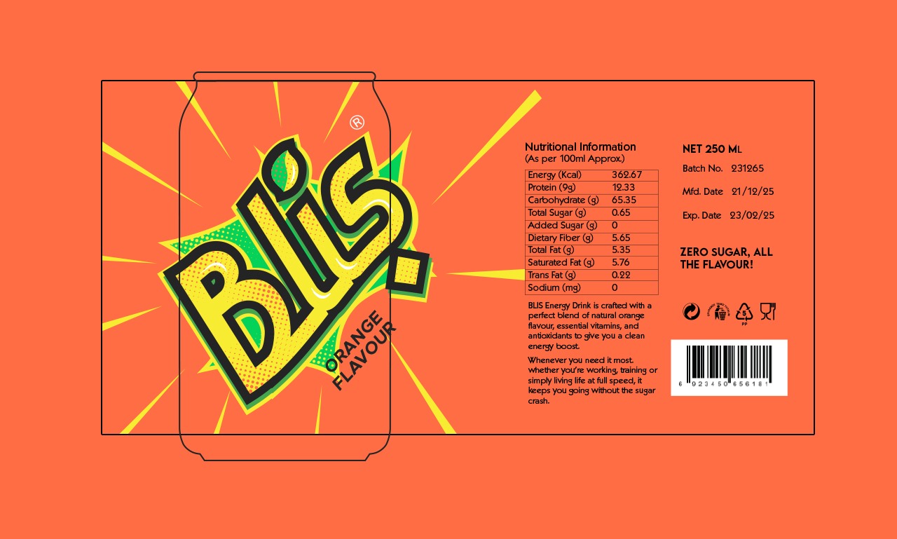
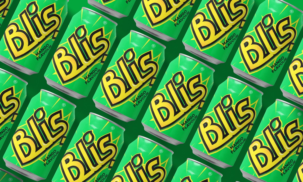
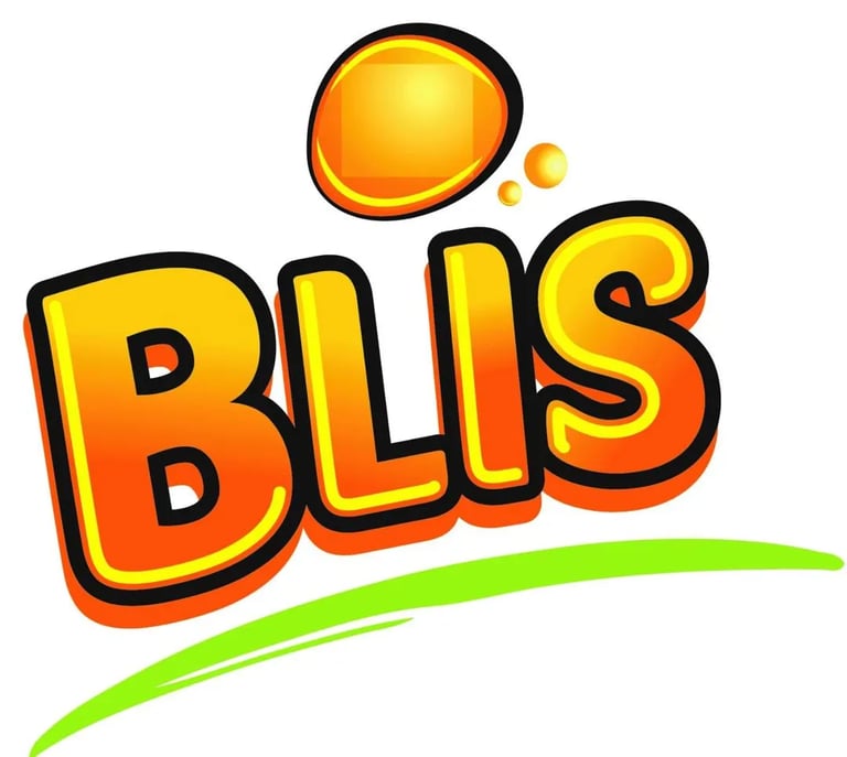
The logo displays the word "Blis" in a highly energetic and dynamic graphic style. It uses a bold, thick, black outline to make the letters pop against the background. The primary fill is a bright yellow with a distinct halftone/dot pattern suggesting a retro aesthetic. Accents of vibrant green and secondary yellow/green "splashes" or starbursts surround the main text, conveying a feeling of excitement, flavor, and explosive energy. The overall look is modern, fun, and designed to capture attention quickly, suggesting a product that is bold and refreshing. If this logo is indeed part of a campaign targeting the Arab population, this vibrant, attention-grabbing design is likely intended to have universal appeal while the accompanying Arabic elements would provide the necessary linguistic and cultural connection
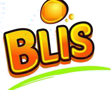
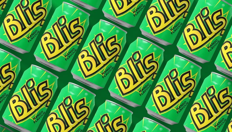
Redesigned logo unit
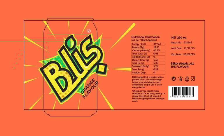
Original logo unit
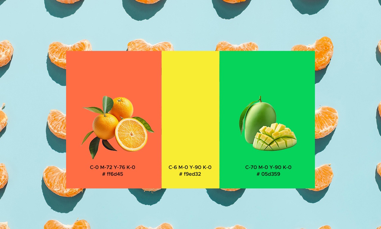
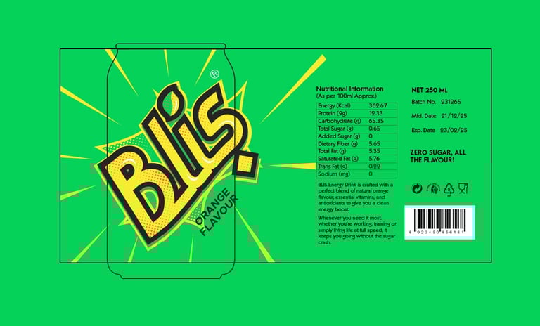
The initial image represents the original logo, which I was tasked with enhancing and reworking. The redesigned version is shown in the second image. The redesign was particularly challenging due to the client’s request for a highly vibrant and attention-grabbing look.